Featured

Week 1 – 03/03/20


Lecture Pods Summary

The Week 1 Lecture Pod explores the following areas:

What is Interactive Design, and what do Interactive Designers do?

  • Interactive Design cannot exist without other specialist areas of design such as Information Design, Web Design and other Software Design. It is an area of design which has features of many other disciplines, including Engineering and Psychology (amongst others).
  • It may be defined as designing spaces for human communication and interaction, as well as designing products to enhance and support people’s everyday lives.
  • Interactive designers create user oriented products that are practical and widely applicable. The main focus of these products is how they affect the experience of the user, and how they can affect broader communities – what they do and why they do it. They receive feedback from the community and use this feedback to either create maps and guidelines for the product or allow the user to move steadily through the product on their own. A key part of this is figuring out what kind of knowledge (and how much of it) the designer expects from their users.
  • There are five key areas of Interactive Design: Interactivity, Information Architecture, Time and Motion, Narrative and Interface.

What is Interactivity?

  • In a broad sense, Interactivity is a process relating to a program or system that responds to user activity – wherein each element is capable of responding to and influencing the other.
  • It can also include the amount of control the users have of the pace of the tool and its content, the choice this control gives to the user and the ability to use the tool to be productive. In this way, all experiences and products can be placed in this category.

Experience Design as an introduction to Interactivity:

  • Data can only become meaningful information when it is organised and presented.
  • Interactive Design allows meaningful experiences to be created, which can build knowledge and therefore wisdom.
Reflection

The lecture pod provided a much clearer insight into the structure and fundamental information of Interactive Design. It gave resources and alternate definitions so I was able to gain multiple perspectives on the topic. I think the lecture pod was extremely thorough and is an excellent introduction to the unit, allowing me to gain more understanding into what I need to do as a designer in the Unit Assessments.

Week 8 – 21/04/20


Lecture Pods Summary

This lecture pod covered the topic of UX research methods:

  • Research can be behavioural and observed by researches, where the researcher watches the user specifically.
  • It can also be self-reported by users, through things like user surveys and feedback where the researcher asks the users questions.
  • These two types of research are called Behavioural and Attitudinal respectively.
  • Behavioural research involves watching people. It has to do with whether the design or process is discover-able, usable, find-able, etc. This needs to be observed, and can be done through something like a usability test.

Image Source: NNgroup (Producers). (2018). When to Use Which UX Research Method [Video Recording]. NNgroup. Received April 25 from https://www.youtube.com/watch?v=OtUWbsvCujM&feature=youtu.be

  • Attitudinal research involves asking and listening.

Image Source: NNgroup (Producers). (2018). When to Use Which UX Research Method [Video Recording]. NNgroup. Received April 25 from https://www.youtube.com/watch?v=OtUWbsvCujM&feature=youtu.be

  • Numbers vs. Stories is also a way to decide which research method to use. Quantitative research (numbers) is used when comparing two designs, bench-marking, or predicting future analytics like costs. Qualitative research (stories) centres on people and is done through methods such as usability tests to quickly improve a design.
  • It is also important to have a clear environment when choosing a research method – is it contextual or controlled?

Image Source: NNgroup (Producers). (2018). When to Use Which UX Research Method [Video Recording]. NNgroup. Received April 25 from https://www.youtube.com/watch?v=OtUWbsvCujM&feature=youtu.be

Reflection

In this lecture pod I learnt some important distinguishing features between different methods of UX research. I learnt that it is important to focus on the context of my research – what my intentions are for my design and what I want to do with the research I will be doing.

I also learnt that there are lots of different ways to perform research in order to gain a wide scope of results, as well as an unbiased response. I think that it is important to do both the primary types of design – behavioural and attitudinal – as that allows for real user feedback, and practical, real advice as well as self-interpretation and opinions. It is important to create a balance.

The website UXBooth goes much further in depth on the topic of UX – it covers much more detailed research methods, types and more, and provide examples to go along with that. One example is given in their discussion of a UX research process, provide a visual representation of the processes discussed (the image can be seen below). The site as a whole is interesting and is a great addition to the lecture pod, giving greater insight and learning opportunities.

A constellation of research techniques.

Image Source: Young, Indi. (2008). Mental Models: Aligning Design Strategy with Human Behavior. New York: Rosenfeld Media. Retrieved April 25 from https://www.uxbooth.com/articles/complete-beginners-guide-to-design-research/

Wireframe and Style Guide review


This week we uploaded our draft style guides and wire frames on to vUWS. We would be giving each other feedback in order to improve these aspects of our assignment for our final hand in.

My wireframe drafts (done in Photoshop) can be found below along with the feedback I have received so far.


I also received feedback from Nathan, who wrote “The wire frame is easy to understand and the layout is clear, however the different sized shapes are confusing“.


My style guide draft and feedback may be found below:


I have completed the final versions of the wireframes in XD, and they look cleaner and more professional than those I did in Photoshop. I have included them below.

Week 7 – 14/04/20


Lecture Pods Summary

The lecture pod this week covered the following topics:

UI Visual Design Patterns:

  • The user experience in the abstract feeling people get from using websites, and the user interface is what people use to access that experience.
  • Interactive web elements should be well planned as they influence directly how the user feels.
  • Design patterns can be used as references.
  • Common NAV menus can fall into the hierarchical, tabs, menus or carousel formats.
  • Tabs come from real world tabs in filing systems, and are an example of web design mimicking the real world. They are used to show a flat, straightforward NAV system.
  • Dropdowns allow the designer to save space on an interface, but does not simplify user experience. They can be used for things like desktop applications.
  • Drawers or hamburger menus provide quick access and a way to save space on a website.
  • Big footers allow for shortcuts to other sites and to pages on different hierarchies.
  • Carousels can be used to browse through lots of information at once.
Reflection

The lecture pod for this week made it easier to think about the design patterns I wish to use in my own interface. I learnt a lot about how to use these different patterns, and what is appropriate for different designs and mediums. I also learned more information about the different patterns that will allow me to apply myself better to design work in the future.

A website that goes into further detail about user interface patters is UI-Patterns (https://ui-patterns.com/patterns/). The site features an extensive list of common design patterns as well as information on when and how each one should be used. For example, their section on navigation tabs features several different examples of the element in different design styles in order for readers to gain a better understanding of their use. The site also features the following rationale and solution on the topic:

Image Source: Toxboe, A. (n.d.). Navigation Tabs [Screengrab]. Retrieved April 14, 2020 from https://ui-patterns.com/patterns/NavigationTabs

Brainstorming – About my Project


Initial Brainstorming

The initial brainstorming I did for my project was basic ideation. I took my base topic – Marine Pollution – and took down my ideas on how to present the idea through different themes, mediums and tones. I came up with the following mind-map:

After this, with the help of my classmates, I narrowed my selection down to three main concepts:

  • An interface stylised to progressively fill the screen with waste – perhaps an informational game or interactive learning tool.
  • A social media-esque site where people could make forums and share ideas on cleaning up the worlds oceans and how to avoid pollution.
  • Building a sustainable life – a choose your own adventure style game where the choices the player makes influence their sustainability score.

I decided to focus on the choose your own adventure style game, and made the following mind map where I looked at the different age groups I could focus on:

These were base ideas to give me inspiration for my project. I ended up choosing to do a kids site, and my concept is different than the ideas I came up with for that age group.

WHAT is my project?

  • My project is a children’s educational learning tool with a focus on the pollution of the world’s oceans and waterways, and how to avoid contributing to it in your daily life.
  • It is a web-based game where the player can choose different options for a set of questions and receive results based on these answers.

WHY this project?

  • I believe it is important for kids and teens to be able to learn basic understanding of this issue in an engaging, fun way.
  • The site will provide this information with real world examples and relatable content to the chosen age group.

HOW and WHERE will this project be used?

  • The project will be used in classrooms or independently for educational purposes, with the intention of provoking greater thought and discussion about the topic amongst classes.

Week 6 – 07/04/20


Lecture Pods Summary

The lecture pod this week covered the following topics:

User Scenarios:

  • A prediction of how specific users will interact with your product in a specific situation.
  • Allows designers to isolate issues with the interface.
  • Should provide the Who, What, When, Where, Why and How.
  • Users with a goal or an issue should be allowed to resolve it within the user scenario – it should be an example of a successful user experience.
  • Begins with a base understanding of who the interface is for. What appeal does it have, and why?
  • Scenarios are narratives describing purpose and interaction. They may discuss goals and motivations, actions, reactions and problems based around a specific user persona.
  • They are not forecasts, but rather serve to illustrate the context of the interface’s use in every day life.
  • The persona and scenario are both fictional, and may not apply to everyone. it is important to make sure the scenario is specific and concise.
Reflection

The lecture pd for this week was brief and quite simple. it focused on the nature of user scenarios and what they are used for when designing an interface with personas in mind. The pod went over what scenarios are, who they apply to and what they do.

Through this pod I gained a better understanding of what to do for my own user scenario – I was able to gain insight into its structure, for example; providing the “who?” first to give context, and then outlining the motivations or goals of that persona, and then the “how?” which can demonstrate how they use the interface to meet their goal or resolve their issue. It was enlightening and gave me a better grasp on the basics of user scenarios and their context.

An example of a user scenario with a lot of detail and comprehensive steps is an example scenario made by UXM (UX for the Masses), detailing the scenario of their user persona Cheryl marking a GCSE paper online. Not only does the scario provide the steps taken by Cheryl, it also provides the questions asked with each step, the knowledge and interface functionality required and comments about Cheryl’s behaviour patterns and thoughts. The graphic can be seen below:

Example UX docs and deliverables | Experience map, Ways to ...

Image Source: UX for the masses. (2019). Example Scenario: Cambridge Assessment [Graphic]. Retrieved April 8, 2020 from http://www.uxforthemasses.com/resources/example-ux-docs/#Example%20scenario:%20Cambridge%20Assessment.

Week 5 – 31/03/20


Lecture Pods Summary

The lecture pod this week covered the following topics:

User Personas:

  • User Personas are the represented goals, behaviours and motivations of a hypothetical group of users.
  • More than one persona is created for most designs, however there should be one primary persona.
  • User Personas include age, sex, occupation, hobbies, preferences, and other details related to the product – things such as behaviour, goals and environment/context.
  • There are many factors in User Personas:
  • Core Audience vs. Fringe Audience: The Core Audience is the audience to satisfy first, and is where your persona should be focused.
  • Small Audiences still need personas – these personas are able to be used across multiple projects and are versatile.
  • Another factor is the task (or the WHAT) your user is performing, and whether or not different personas would be doing different tasks.
  • What part of the task are you designing? The beginning? Middle?
  • What devices are the users using? Mobiles are common with younger users, for example, but desktops may be more common with older audiences.

Mental Models:

  • The thoughts a user forms around an idea or activity.
  • They illustrate how a user works around different problems, as well as their expectations for different interface.
  • Including these things in personas allows for a more correct and cohesive user flow and site structure.

Artefact Personas:

  • The discussion of the personality of the project, taking it away from personal likes/dislikes and giving it a strong visual communication system.
  • Asking the questions: if this product was a person, what would it be like? What celebrity or car would it like? How would you recommend it to a friend? How is it different from competitors? How would you expect users to react when first seeing this product?
Reflection

The lecture pod this week went over what we did last week in the tutorial – User Personas. Because much of the pod was a revision of last week’s work, I felt it could have been shorter while maintaining its key points. However, I did think the examples shown and the explanations of them were informative and gave greater understanding of what a good user persona or artefact persona does for a product.

I did learn from this lecture that understanding who you’re designing for is absolutely crucial when creating an interface – the user personas guide the creation of the product, as they are your target, and the artefact personas add the personality the product needs in order to reach that target and those people. Creating a product with the two personas in mind is important in creating something with longevity and meaning.

Below is an example of a user persona:

How to Create a User Persona (with Examples) | CleverTap
Image Source: Karnes, K.C. (2019). How to Create a User Persona (with Examples) [Graphic]. Retrieved March 31, 2020 from https://clevertap.com/blog/user-personas/

User Profiles


About the Project

This project involved us creating two user profiles for our Design Document to demonstrate examples of our target audience. to do this we used Xtensio, which provided templates for us to use as a base.

For my project, my target audiences are teenagers and children, so my two examples of user profiles are a 17 year old student and a 34 year old teacher. I picked the teacher specifically because I want my interface to be a widely accessible educational tool, and the easiest way for kids to access it would be through a school project.

My user profiles are seen below:

  1. Sarah Goodman:

2. Josephine Smith

Mood Board


About the Project

For this project we were asked to create a practice mood board for the example user profile on vUWS. This involved finding images that matched his identity and putting them together in a collage in Photoshop. The mood board was fairly simple to make and good practice for the ones we will need to do for our own user profiles later.

The user profile was one made by the staff, and it was for a user named Dave Smith. It can be seen below:

My mood board is seen below:

Week 4 – 24/03/20


Lecture Pods Summary

The lecture pod this week covered the following topics:

Instructional Design:

  • Instructional Design is the design of instructions with the purpose of giving the user an easy to use step by step guide to their product.
  • It should take into account the possible societal and cultural differences of each user and ensure that the instructions are effective for a wide array of people.
  • For example, IKEA’s instructions are almost purely visual, and are too simplistic – they are so hard to understand that they almost become useless.
  • Cognitive Load Theory: We as consumers use our Working Memory – the way we manipulate information stored in our short term memory. It is limited, however, based on the individuals ability to retain information.
  • Using this theory, if instructions are split into information and visual examples, and these things are remote and on different sides of the page, then it overloads Working Memory and limits the functionality for those instructions.
  • Having a sense of salience within information – e.g. having a well labelled image – can allow users to retain information more effectively.

Interactive Instructional Design:

  • Instruction: the user telling the system to do something, i.e. clicking a button (for example, the use of piano).
  • Conversation: Having a back and forth with the system, i.e. inputting personal information and receiving a personalised outcome.
  • Manipulation: drag and drop elements, changing the structure and appearance of the interface, for example personalising a desktop background.
  • Exploration: game-like, playful – games with choices or open world systems, map systems with the ability to explore at will.
  • Challenges of working with interactive screens include: Size and resolution, the users, the user’s preferences, redundancy, etc.
  • However, there are also some opportunities within interactivity that counteract these challenges: the added dimension of time, and the ability to layer elements being a couple of them.
Reflection

The lecture pod this week was really well put together with a lot of examples of both bad and good instructional design. One aspect of the lecture pod I learnt a lot from is the examples shown – the distinguishing of bad a good instructional design and the features of both. This helped me see how simple things like type placement and illustration placement can be the difference between good and bad design.

I also learnt how instructional design can be linked to interactive design, which will help when applying some instructional design to my own interface, particularly exploration or conversational elements.

An example of interactive instructional design is an in-game tutorial for games such as Cut the Rope. In game tutorials such as this are, if well-designed, excellent examples of interactive design as they require the player to actively participate in the instructions. In the case of Cut the Rope, this is done through a tutorial level, wherein the player has to complete each step of the instructions to progress in the game. This system ensures the player not only has an understanding of how the game works but also the ability to repeat the steps in each of the following levels. Examples of the game are seen below:

Image result for game tutorial design
Image result for cut the rope instructions

Image Source: Zeptolab UK Ltd. (2010). Cut The Rope [Screenshots]. Retrieved March 24, 2020 from https://cuttherope.net/#ctr

What is Information Design?


Definition

According to the Society for Experiential Graphic Design (SEGD), Information Design is “… the practice of presenting information in a way that makes it most accessible and easily understood by users.” It is a combination of visual design and data organisation and is becoming increasingly important for designers working to create interactive designs for clients in various industries, presenting information in a way that is aesthetically appealing and effective in communicating meaning.

Effective Information Design allows users to navigate complex design layouts via a sound hierarchy of information which establishes the importance of each element. It is able to present a lot of data while simultaneously eliminating the user’s potential frustrations with the design.

Examples

The Bon Iver Visualiser is dedicated to displaying the streaming data for Bon Iver’s albums. It is an unconventional piece of information design, as it doesn’t use graphs or illustration, but rather pure text throughout the site – everything on the page is made of small letters (the i letter), and there is no colour on the site beyond pop-up images.

The data on the site is organised based on each country, and the site also gives the latitude and longitude of each country. One problem with the site is that its information is out of date and could do with updating, but otherwise it is a clear example of non-conventional information design combined with an interactive interface.

Examples from the site are seen below:

Image Source: BON IVER. (2019). ViiSUALiiZER. Retrieved from https://boniver.withspotify.com/

Ledger Investing brands themselves as a technology based company providing security in insurance payments and investing. They allow clients to invest in new assets while doing this. Their website is clean, geometric and simple, providing snippets of data and examples of their services to potential clients. To access the full site you have to request access, but their approach to displaying data is clear just from looking around the accessible sections of the site.

The soft blue-greens and minimalist icons on the site make the content clear and direct, and the animations add interest to the site. The examples given of their work seem to follow the rest of the site – the data is clear, there is a structured hierarchy of information and consistent imagery to optimise user experience.

Examples from the site are pictured below.

Image Source: Ledger Investing. (2018). Ledger Investing. Retrieved from https://www.ledgerinvesting.com/

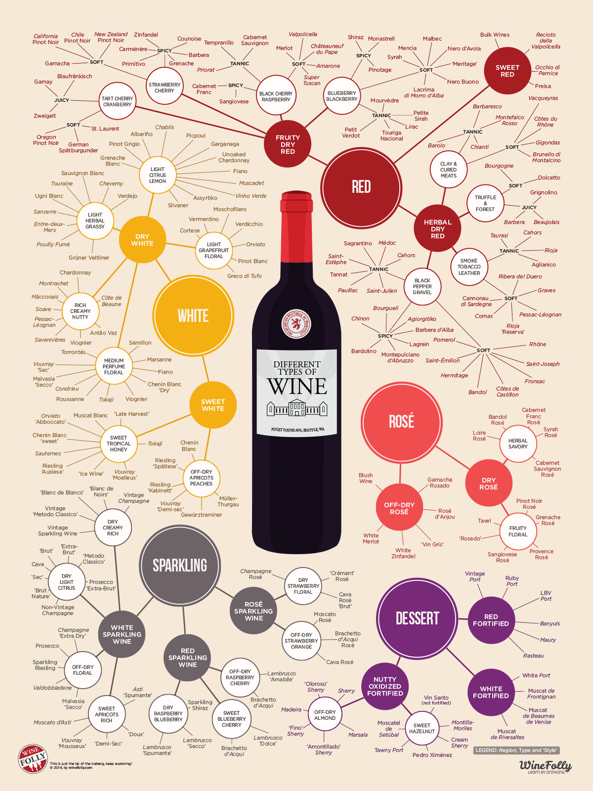
This poster is an excellent example of Information Design. It provides a clear map of the different kinds of wine, the different flavours and the different tones of the drink. Each section of the map is evenly spaced and despite the number of elements in the design, the information does not appear cluttered, which is crucial.

This is in part due to the use of colour coding. Each section of the map is a different colour, each one a dusky, warm tone that ties in nicely with its subject matter. The distinction of different elements join with the wine bottle in the centre of the poster to make the whole image cohesive and easy to understand. The image can be seen below.

Different Types of Wine - Updated

Image Source: WineFolly. (2010). The Different Types of Wine [Infographic Poster]. Retrieved from https://winefolly.com/deep-dive/different-types-of-wine/.

Create your own website, free on WordPress.com.Create your own website.
Start free