
Definition
According to the Society for Experiential Graphic Design (SEGD), Information Design is “… the practice of presenting information in a way that makes it most accessible and easily understood by users.” It is a combination of visual design and data organisation and is becoming increasingly important for designers working to create interactive designs for clients in various industries, presenting information in a way that is aesthetically appealing and effective in communicating meaning.
Effective Information Design allows users to navigate complex design layouts via a sound hierarchy of information which establishes the importance of each element. It is able to present a lot of data while simultaneously eliminating the user’s potential frustrations with the design.
Examples
- Bon Iver Visualiser (https://boniver.withspotify.com/)
The Bon Iver Visualiser is dedicated to displaying the streaming data for Bon Iver’s albums. It is an unconventional piece of information design, as it doesn’t use graphs or illustration, but rather pure text throughout the site – everything on the page is made of small letters (the i letter), and there is no colour on the site beyond pop-up images.
The data on the site is organised based on each country, and the site also gives the latitude and longitude of each country. One problem with the site is that its information is out of date and could do with updating, but otherwise it is a clear example of non-conventional information design combined with an interactive interface.
Examples from the site are seen below:


Image Source: BON IVER. (2019). ViiSUALiiZER. Retrieved from https://boniver.withspotify.com/
- Ledger Investing (https://www.ledgerinvesting.com/)
Ledger Investing brands themselves as a technology based company providing security in insurance payments and investing. They allow clients to invest in new assets while doing this. Their website is clean, geometric and simple, providing snippets of data and examples of their services to potential clients. To access the full site you have to request access, but their approach to displaying data is clear just from looking around the accessible sections of the site.
The soft blue-greens and minimalist icons on the site make the content clear and direct, and the animations add interest to the site. The examples given of their work seem to follow the rest of the site – the data is clear, there is a structured hierarchy of information and consistent imagery to optimise user experience.
Examples from the site are pictured below.


Image Source: Ledger Investing. (2018). Ledger Investing. Retrieved from https://www.ledgerinvesting.com/
- The Different Types Of Wine (Poster) (https://winefolly.com/deep-dive/different-types-of-wine/)
This poster is an excellent example of Information Design. It provides a clear map of the different kinds of wine, the different flavours and the different tones of the drink. Each section of the map is evenly spaced and despite the number of elements in the design, the information does not appear cluttered, which is crucial.
This is in part due to the use of colour coding. Each section of the map is a different colour, each one a dusky, warm tone that ties in nicely with its subject matter. The distinction of different elements join with the wine bottle in the centre of the poster to make the whole image cohesive and easy to understand. The image can be seen below.
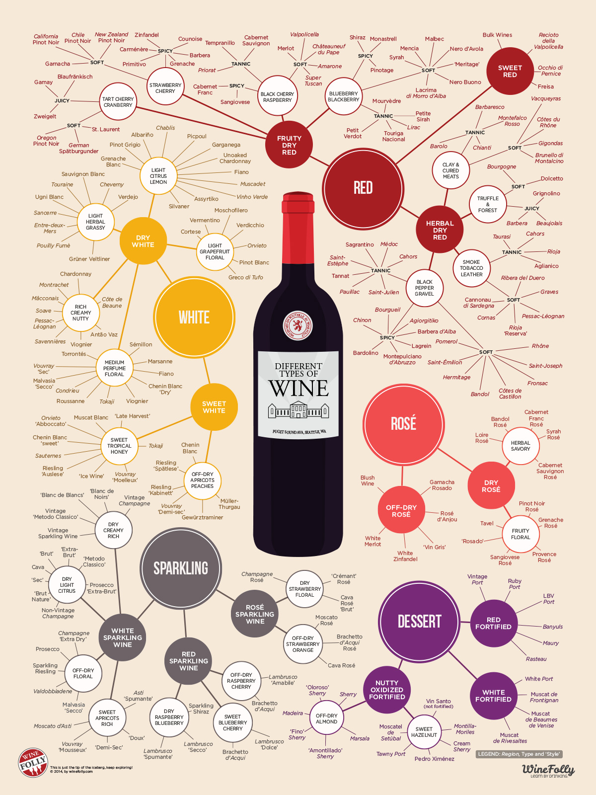
Image Source: WineFolly. (2010). The Different Types of Wine [Infographic Poster]. Retrieved from https://winefolly.com/deep-dive/different-types-of-wine/.
