Week 3 – 17/03/20


Lecture Pods Summary

The lecture pod this week covered the following areas:

Design Patterns in Interactive Design:

  • Having similar design patterns to others is not necessarily a bad thing – it is indicative of the way the web has changed based on consumer need and preference.
  • For example, the hamburger menu is one of the more widespread symbols on the internet – it makes it simple and easy to use.
  • It’s a great way to hide drawer content – content that the designers may not want to be constantly visible.
  • Due to the use of mobiles, long-scroll sites are also more common to create a clutter free navigation system.
  • Cards on sites such as Pinterest are also used more often to allow for the expansion or shrinking of pages for different devices.
  • Hero images and animation are also being used to give personality and storytelling elements to a site. They have more impact on users and add interactions to the site.
  • These animations include hover animations, loading animations, slideshows, etc,
  • Material design is used to create realism for the user through shadows and the simulation of movement, with the goal of creating cleaner user-oriented design patterns.
  • Responsive design is a simple, cheap way to be accessed on all devices. It tends to be minimalistic and focuses on rearranging the site’s elements to fit each different screen size.
Reflection

The main thing I took away from the lecture pod this week was that Interactive Design has its own universal conventions. The demonstration of how common some designs can be – making them patterns – was very interesting as it showed how well elements such as the Hamburger menu actually work, as well as how often they are used by industry professionals. I learnt from this that those patterns can be used by several designers and form parts of completely different projects, as well as that those elements are OK to use in my own work.

However I think I didn’t learn as much as I should as the lecture pod only went over the basics. It didn’t discuss less common alternatives, nor show particularly different examples of the conventions or how they could really be used in unique ways. I would have loved to learn about more ways these patterns could have been applied.

For example, Renaud Rohlinger’s Design Portfolio uses one of these more common patterns (Long Scroll) in a creative way, showcasing his own art and animation skills throughout the site. The scroll is a zoom around the illustrated world Rohlinger has created, and gives the illusion of a super-fast zoom to the other parts of the site. It takes something common and makes it an exciting and unique layout. Examples from the site are seen below:


Image Source: Rohlinger, R. (n.d.). Renaud ROHLINGER [Screenshots]. Retrieved March 17, 2020 from https://renaudrohlinger.com/

Interface Design Project


This project was done alongside the user flow and site maps that we completed for our ongoing toast project. For this segment, we had to make the visual screen designs for our interface on toast with indications of the interactive elements.

My interface is extremely simple, however I wanted it to be as the design is in line with the level of information being presented. It is a very easy to use three page site with a toast colour scheme of a variety of browns. I also chose not to use photo graphs on my site as it would disrupt the sites style.

The interactive elements I chose to include in the interface were a card deck and a click/hover scale. These elements are suited to their topics: the cards for a multi-step process and the scale for the heat settings.

Below are my visual designs with brief annotations:

Site Map and User Flow Project


Over the past few weeks we have been expanding on our exercise of making toast – primarily in regards to setting up a mock user interface for the project. A part of this expansion has been creating a site map detailing user flow around the site.

Due to the minimal content we have – just the steps for making toast – it has been difficult to create a fully realised site map, as there isn’t a lot of room for complexity in whatever interface we design. However, there is a way to work around this by adding pages which detail topics such as the effects of each heat setting, different types of bread, etc.

For my own site-map (pictured below) I chose to include three main pages: The home page, the Process page (which details the process for making toast), and the Heat Slider page (which contains a slider demonstrating the effects of different heats on different breads).

The heat page and process page will both contain elements of static information alongside the interactive sections I will be including. They will also be including drop down navigation to allow the user to travel between pages easily.

I integrated elements of user flow into the site, the primary aspect of which is the choice to either learn more about toasting bread or learn HOW to toast bread. I have also included more user flow in red:

This site map is the basis for my wire-frame and screen design projects on the same topic, and will guide me in creating a site with optimal flow and function.

Week 2 – 10/03/20


Lecture Pods Summary

The lecture pod for this week covered the following areas:

Design Processes and Overviews

  • There are 8 distinct steps in the process of interactive design. The example used in the lecture pod is pictured below:

The steps chronologically are:

ERROR/ISSUE -> IDEA -> METAPHOR -> SCENARIO/DESIGN ->TASK ENGINEERING -> MODEL -> PRESENTATION -> MANIPULATION OF INTERACTIVE ELEMENTS

  • Working through a design process through lower tech mediums such as drawings or sticky notes allow the designer or client to fully address and analyse what the issue or problem is that is being solved, giving them a greater understanding of how to solve it.
  • It is important to build profiles of users and clients, as well as perform research of precedents and design software when in the process of design.

Context – FOR and OF use:

  • Context is used to define a situation, the people in said situation, and their various needs or wants. As designers it is important to take context into consideration as it allows for us to facilitate for peoples needs and make our products more accessible.
  • When designing for a client, we must understand what people are trying to do, how they are trying to do it, what might get in the way of that and where they are doing it.
  • What is the situation? It is important to examine where the viewer is physically, and what device they are using. What environment are they in, and are they in public or private spaces?
  • Who will be using the interface and how long for? It is necessary to establish who your user is – whether there are one or more people using the interface, whether they will be able to focus on the interface, etc.
  • Will the design be simple or easy to use? A measure of complexity must be established based on the needs and experience a viewer has – if there is an emergency or crucial interaction happening on the interface a complex interaction may not work.
Reflection

The lecture pod this week was a reminder to always think about the audience when designing. When coming up with a process it is important to think about problems the audience may have, and when thinking of context scenarios the same mindset must be adapted. I think the questions we were given to ask ourselves were a good way to encourage this sort of thinking and allow in depth analysis of our own designs and processes, as well as whether or not we answer the needs of the audience.

An example of the use of context of and for is Illuminating Radioactivity, a site dedicated to educating its audience on radioactivity and its history. It understands its viewers are trying to learn about radioactivity on the internet and are looking for an engaging website to aid in their experience. They understand that information on the topic of radioactivity can be quite dry or uninteresting, so they designed an interactive, colourful website to solve this issue. Examples of the site are shown below:

Image Source: Illuminating Radioactivity. (n.d.). Illuminating Radioactivity [Screenshots] . Retrieved March 10, 2020 from https://illuminating-radioactivity.com/

Week 1 Class Notes


In this week’s tutorial we covered the following topics:

  • Unit outline/Introduction – we went over what the structure and content of the unit would be this semester. Within this discussion we were given Assessment information, various links to resources for the Assessment topic (issues with the Marine environment and how to learn about/solve them) and the basics of what interactive design can look like (including examples of previous students work).
  • Structuring/planning an interactive design – this section of the tutorial focused on giving us the means of structuring the basic programs and methods of creating interactive designs. We focused specifically on flow charts, examining how creating a step-by-step program can allow greater understanding of and access to design. We created our own comprehensive flow charts on the topic of how to make toast, with the aim of making the process as simple as possible.

I enjoyed this tutorial as it provided a clear, concise overview of our unit and allowed us to begin research into our assessments while also building the base skills of interactive design. I learned a lot in the 3 hours of the tutorial and feel prepped to keep working on my assignments for the unit without stressing too much.

I think there could have been a more thorough explanation of the technical tools we are allowed to use but on the whole this tutorial served as a comfortable introduction to Interactive Design.

Precedent Project


About the Project

This project forms a part of our Interactive Design assessment task. As a part of our research we have to find examples (precedents) of Interactive Design with the same topic as our assignment (Marine Environmental Issues). We worked in groups for this project in order to establish a stronger project.

My Project

The website I chose for this project is the Australian Marine Conservation Society (AMCS)’s website, or more specifically, their pages on the topic of Coral Bleaching. I used the site in particular because it presents its information in an engaging way using various interactive elements. Below is the research I did with my partner Sabrina:

  • What is the interactive about?

The interactive is focused on the environmental issue of coral bleaching and its effects on the underwater ecosystem. The site establishes the main causes of coral bleaching, as well as what it is doing to the Great Barrier Reef and other coral reef biomes around Australia. It is a sub-page of the Australian Marine Conservation Society’s website and is part of one of their many campaigns aiming to preserve marine ecosystems in Australia. 

  • What can you say about the visual design (layout, colour, etc.)? How would you describe the style?

The visual design is minimalistic and uses photographs to keep the viewers eye drawn to the page. 

Sub-pages are presented using a tile format which includes a hover feature – hovering over the image in the tile provides a brief overview of that the destination page is about, and the page also has a hover-based dropdown menu and in-page tabs on the About page. There are hover effects on some buttons and on the site’s social media links as well. These elements all combine to make the site’s design interactive but easily accessible – none of these elements are difficult to find and they’re all cohesive in the overall scheme.

The site uses two main colours: An elegant blue and white. Variations on the blue tone are seen throughout the site depending on the page, and some pages have warm oranges and coral reds. The colour combination of the site is typically oceanic, but it is still simple and elegant enough to allow the reader to view the page easily. The red, for example, is bright but not overly bold and adds interest to the otherwise white and blue page.

  • Who is it designed for (who is the target audience)?

The site is designed for the following groups: Environmental Researchers and Activists, Students and middle aged adults.

Based on the design aspects of the website, it is evident that the website is predominantly accessible towards non tech-savvy audiences. In particular, the hovering effects where pop up menus and information are presented make the website easy to use for viewers simply looking to locate things easily and access information easily. The website is clearly aimed towards activists as suggested by the choice of strong and vibrant colours that voice a stress on change in the environment. I think the website is very informative and clear about its aims by the way it interacts with the viewer.

  • What knowledge does it assume of the digital audience (e.g. digital literacy)?

The website is an ‘easy to read’ structure where digital literacy is not necessarily assumed by the viewer. Judging by the easily accessed information such as the hover effects that are placed on navigation and information, it is making the use of the website easy to use for the target audience. Particularly accessible to the elderly or middle aged audience that are not as technologically knowledgeable.

  • Describe the type of user interactions and user interface.

The website requires users to hover over objects of interest, scroll through the page for information to pop up or images to move into perspective. The interaction is natural, allowing the viewer to comfortably know where they are within the screen. It also uses graphic design and motion to assist in the interaction where the viewer receives a response when they appeal to hovering over objects of interest. It is therefore engaging with the information and activating the cognitive process through audience response. 

Examples from the website

Image/Information Source:

Australian Marine Conservation Society. (2018). About. Retrieved from https://www.marineconservation.org.au/about/

Australian Marine Conservation Society. (2018). Coral Bleaching. Retrieved from https://www.marineconservation.org.au/coral-bleaching/

What is Interactive Design?


Definition

Interactive Design can be classified as the designing of a product with the specific purpose of being used by a wide range of audiences. Products with interactivity focus on the experience and knowledge of the audiences and aim to create an immersive experience through many different mediums. These mediums can be as complex as international social media platforms (such as Instagram or Twitter), or as simple as books and magazines.

Interactive design supports people in their everyday lives, making processes simpler, easier and more engaging. it gives its users control over the products they have access to and generally allows for greater understanding of the world.

Examples

An interactive adventure by Pierre Herme & Nicholas Buffe is an interactive website featuring a digital story told through animation, drag and drop elements and illustration. It is branded as an “exclusive interactive experience” combining “ancestral myths, manga culture, Renaissance and Baroque art”, and tells the story of ‘The Kingdoms of the Moon and the Sun.’

Almost every element on the site is animated, creating a dynamism which enhances the audiences experience. The story also features small mini games and quests to maximise its interactivity.

The site is an excellent example of complex Interactive Design. The process in making the site and its artwork was likely long and difficult – on the site’s ‘about’ page, it states that the project began in 2016, and two of the three chapters of the story are not yet available.

The screengrabs below are examples of the site’s artistic design, and of the main interactive feature of the site (drag and drop).

Information/Image credits: Herme, P., & Buffe, N. An interactive adventure by Pierre Herme & Nicholas Buffe. Retrieved from http://pierrehermenicolasbuffe.com/en/about , http://pierrehermenicolasbuffe.com/en/chapter-1#

Hi Fly is a website dedicated on the HiFly Airline and is an informational website designed to teach potential customers about the airline’s services. It provides specifics about the various models of planes offered by the airline and uses a clean, minimalist design style to make the information cohesive and easy to digest.

The site features animated vectors of aeroplanes, animated text and drop-down menus. It also features animated diagrams of planes which provide the seating plans of the vehicle when hovered over. The colour palette of the site is also very clean and simple, using sky blues and greys to create the illusion of the sky throughout the site.

The site’s structure is very interactive as well, featuring scrolls and hover mechanics to guide the viewer through all the information the site has to offer.

The screengrabs below are examples of the site’s design and overall aesthetic.

Information/Image credits: HiFly Airlines (n.d.). Hi Fly. Retrieved from https://hifly.aero/

Ocean School is an educational website dedicated to information on the world’s oceans. It has a design concept based on the depths of the ocean, and the interactive features of the site support this. The information on the site is presented through a scroll system, and the imagery on the site is also aquatic, with photos of underwater animals such as whales and fish.

The site also features animated loading screens, animated hover-over images and wave effects on various site elements. These features all combine to create an immersive experience for the site’s viewer and make the site as a whole more cohesive and engaging.

The screengrabs below are examples of the clean structure and rich palette of the site:

Information/Image credits: Ocean School (n.d.). OceanSchool. Retrieved from https://oceanschool.nfb.ca/

Flowchart Project


Tutorial Date: Tuesday 3rd March, 2020 (Week 1)

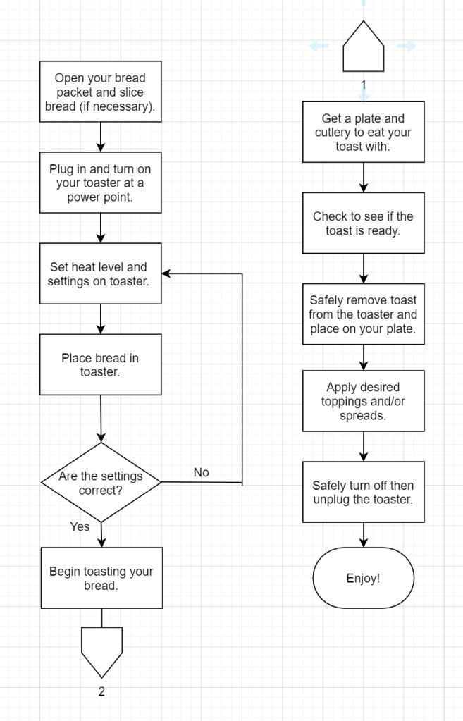
In the tutorial we did a small project where we focused on how to provide a step-by-step process to a user. This consisted of examining and creating flowcharts for a specific process. The aim was to make the process as simple and accessible as possible.

Our process was deceptively simple – how to make toast. We first created a numbered list of this process (under the assumption that the user already had bread and a toaster with them), making sure to include some flowchart conventions. These included options for the user (Are the settings on the toaster correct?) and extremely simple steps (open the bread packet). Below is my numbered list:

We then moved on to transforming our lists into a flowchart. We followed an example flowchart provided on vUWS to guide us in this process. For the flowcharts we didn’t need as many steps as the list, so I removed some unnecessary steps in order to simplify my chart. The chart is pictured below.

Week 1 – 03/03/20


Lecture Pods Summary

The Week 1 Lecture Pod explores the following areas:

What is Interactive Design, and what do Interactive Designers do?

  • Interactive Design cannot exist without other specialist areas of design such as Information Design, Web Design and other Software Design. It is an area of design which has features of many other disciplines, including Engineering and Psychology (amongst others).
  • It may be defined as designing spaces for human communication and interaction, as well as designing products to enhance and support people’s everyday lives.
  • Interactive designers create user oriented products that are practical and widely applicable. The main focus of these products is how they affect the experience of the user, and how they can affect broader communities – what they do and why they do it. They receive feedback from the community and use this feedback to either create maps and guidelines for the product or allow the user to move steadily through the product on their own. A key part of this is figuring out what kind of knowledge (and how much of it) the designer expects from their users.
  • There are five key areas of Interactive Design: Interactivity, Information Architecture, Time and Motion, Narrative and Interface.

What is Interactivity?

  • In a broad sense, Interactivity is a process relating to a program or system that responds to user activity – wherein each element is capable of responding to and influencing the other.
  • It can also include the amount of control the users have of the pace of the tool and its content, the choice this control gives to the user and the ability to use the tool to be productive. In this way, all experiences and products can be placed in this category.

Experience Design as an introduction to Interactivity:

  • Data can only become meaningful information when it is organised and presented.
  • Interactive Design allows meaningful experiences to be created, which can build knowledge and therefore wisdom.
Reflection

The lecture pod provided a much clearer insight into the structure and fundamental information of Interactive Design. It gave resources and alternate definitions so I was able to gain multiple perspectives on the topic. I think the lecture pod was extremely thorough and is an excellent introduction to the unit, allowing me to gain more understanding into what I need to do as a designer in the Unit Assessments.

Create your own website, free on WordPress.com.Create your own website.
Start free